

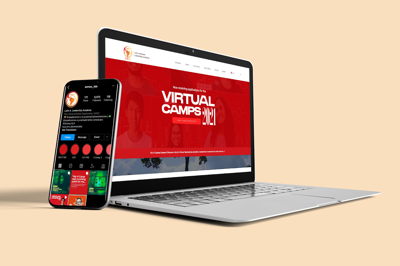
The Latin American Leadership Academy, or LALA, is an NGO that's mission is to promote sustainable economic development and strengthen democratic governance in Latin America by developing and connecting a new generation of principled and socially innovative leaders.
While working at LALA one of my primary projects was to create and lead the logo rebrand. The rebrand was to be a much needed update on the current logo while also offering many opportunities for community engagement and input. This was done so by having community surveys, logo design submission raffles, and our very own design-a-thon.
Research
Color votes on survey
Symbol Collage
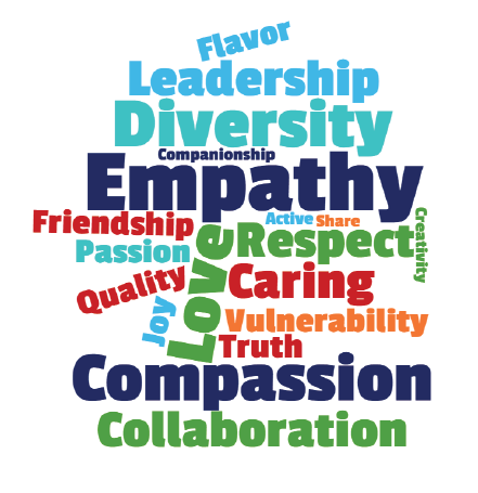
Values or Virtues
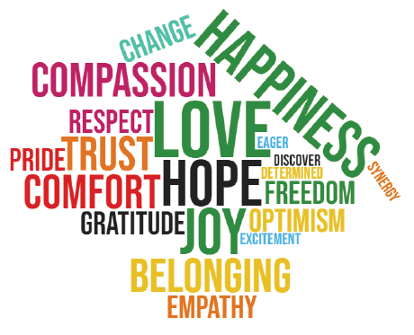
Feelings or Emotions
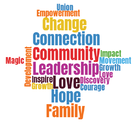
Overall Meaning
The purpose of our community surveys was to help us create a logo based upon what the people of LALA actually think of when they talk about, learn from, and experience at LALA.
We asked about clear logo related questions like color preferences and symbol representation. We also wanted to hear about the community's values(left), emotions(center), and overall meaning(right) when they think of LALA, represented in word-clouds after analyzing the data.
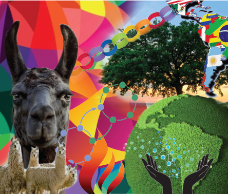
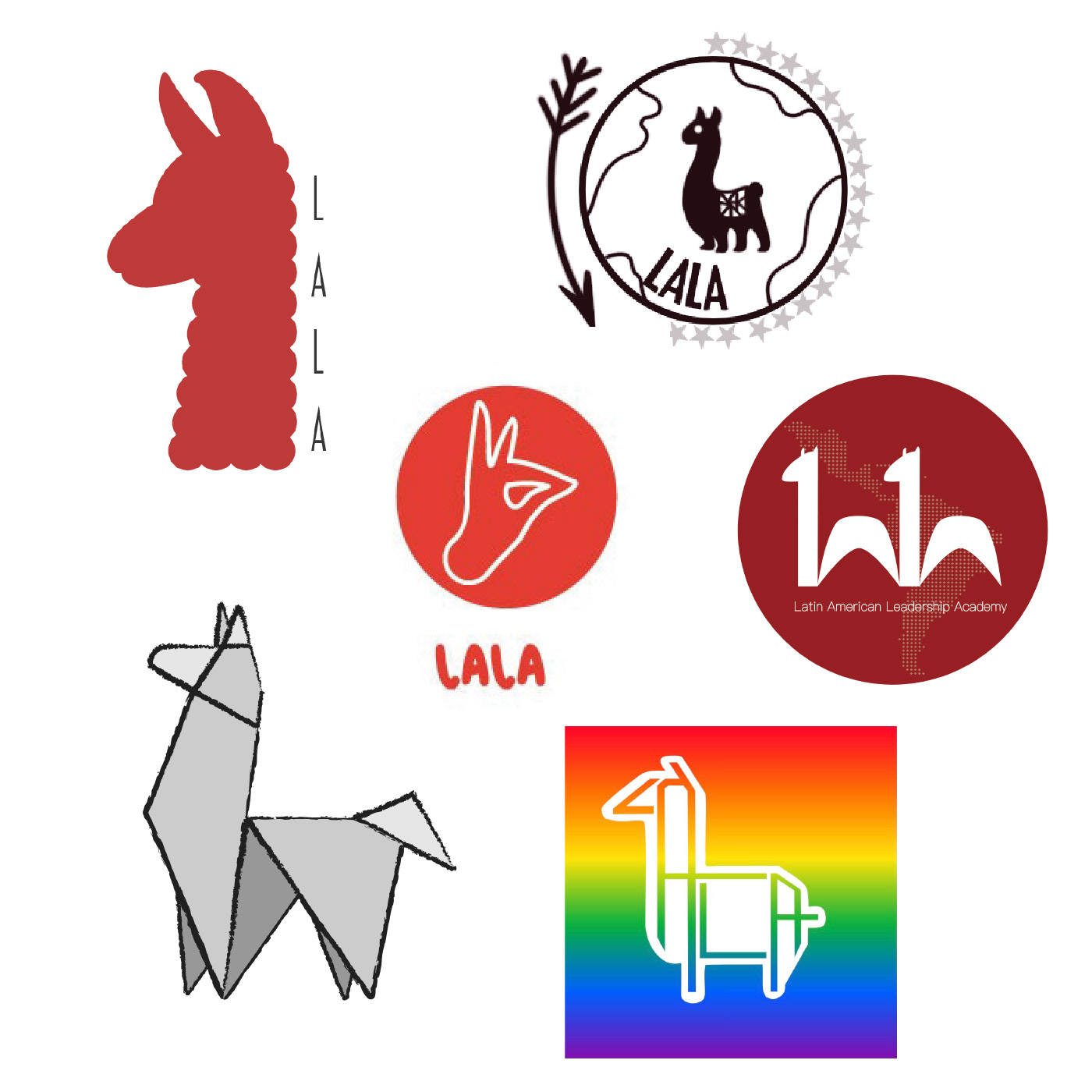
Lastly, in the top right is a collage created of suggested symbols submitted that could represent LALA in a logo. Popular submissions were a Llama (a LALA student favorite), nature/trees, map of Latin America, chains, hands, and fire.
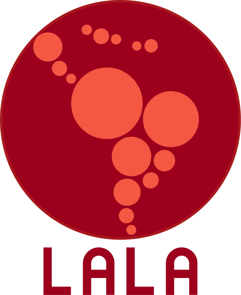
On the right was the old LALA logo. It needed to be updated for several reasons, and had many areas upon which it could be improved.
Some key areas that immediately stuck out to me for areas of improvement were scale ability, color, recognizability and versatility. This logo did not represent the fun, youthful side that LALA really needed to be shown.
Community Engagement
Shown above are some of the very creative and exciting submissions that we received from our community submissions over the course of a few weeks. Students, Alumni, parents, and LALA fans from all over the globe participated in creating a logo submission and sharing what they felt LALA represented to them.
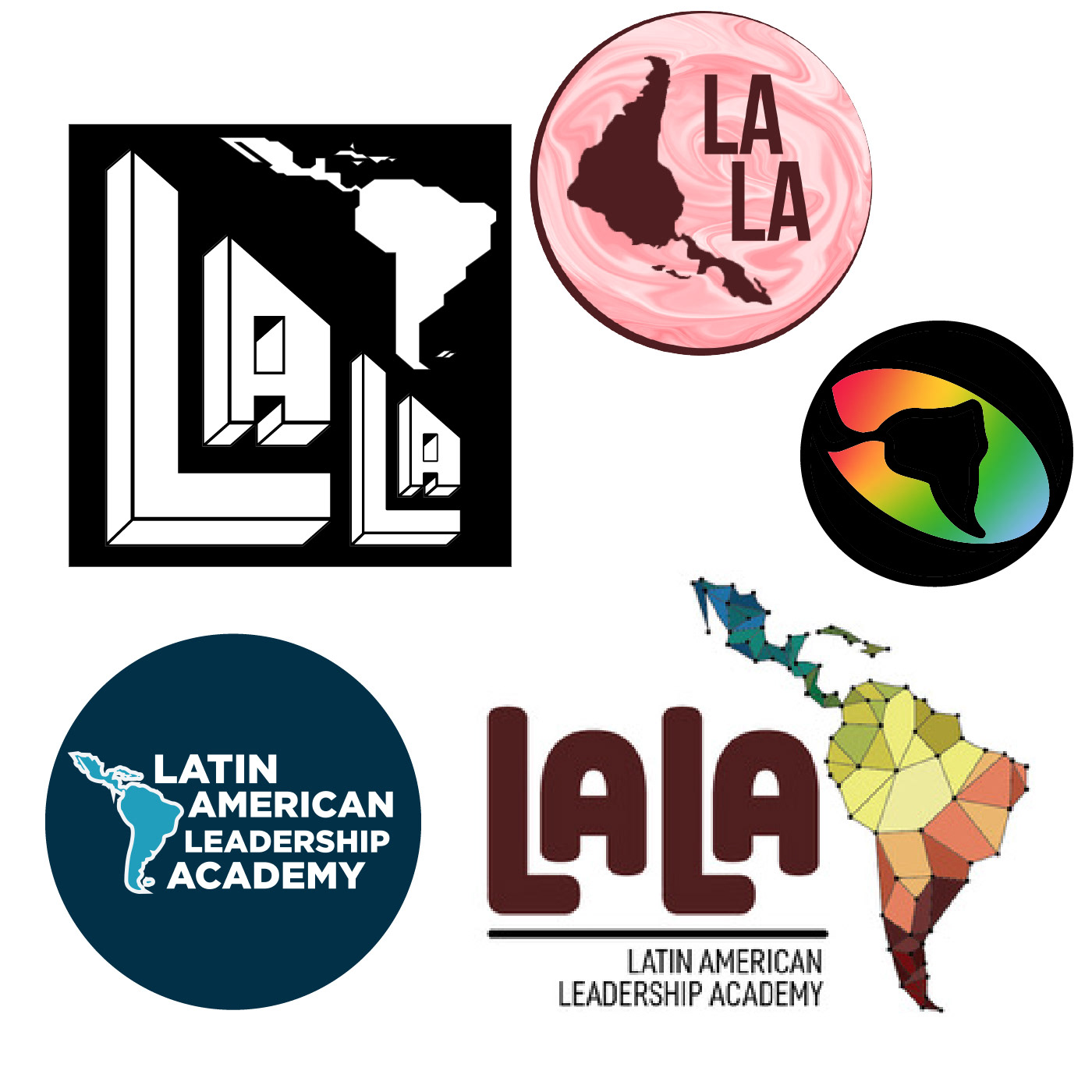
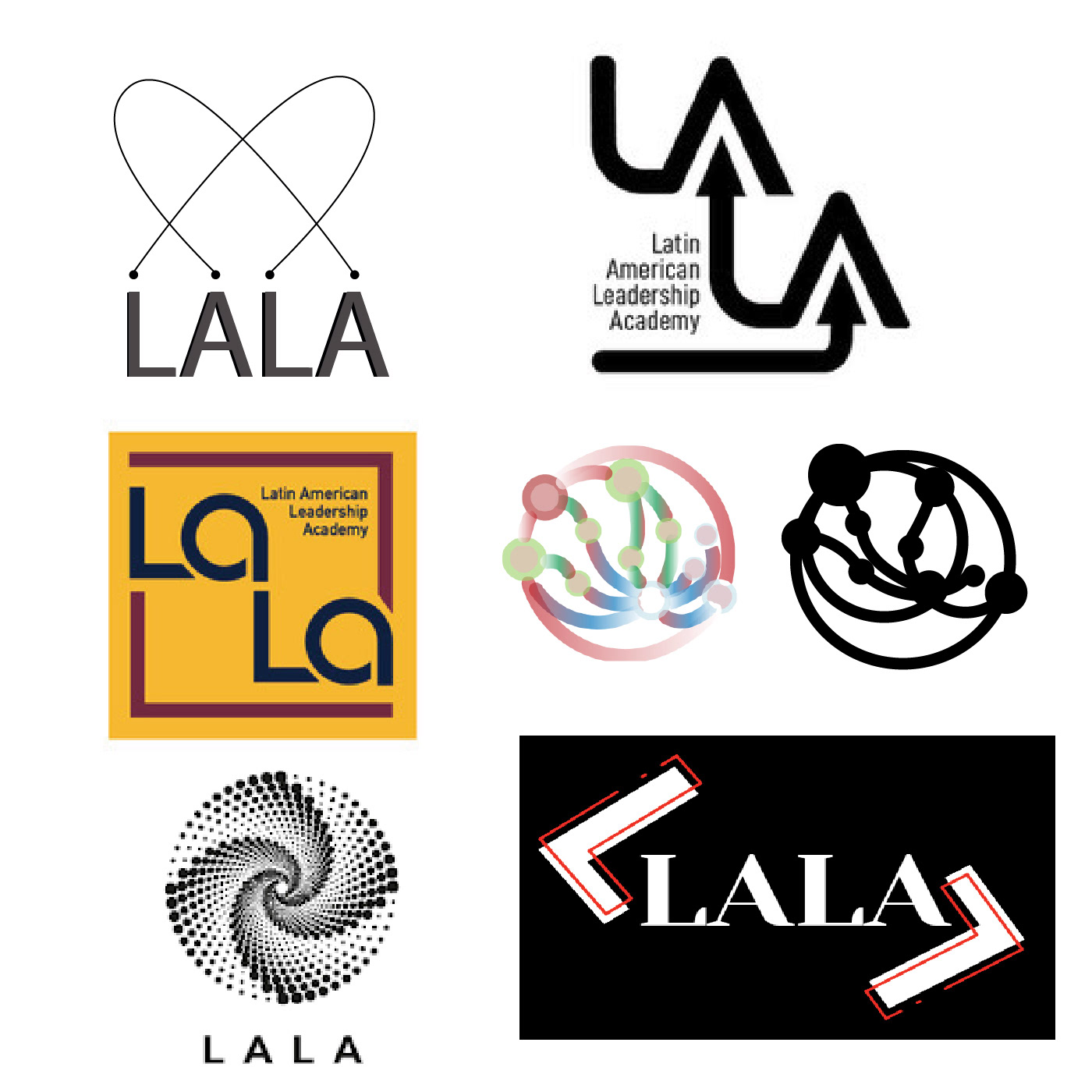
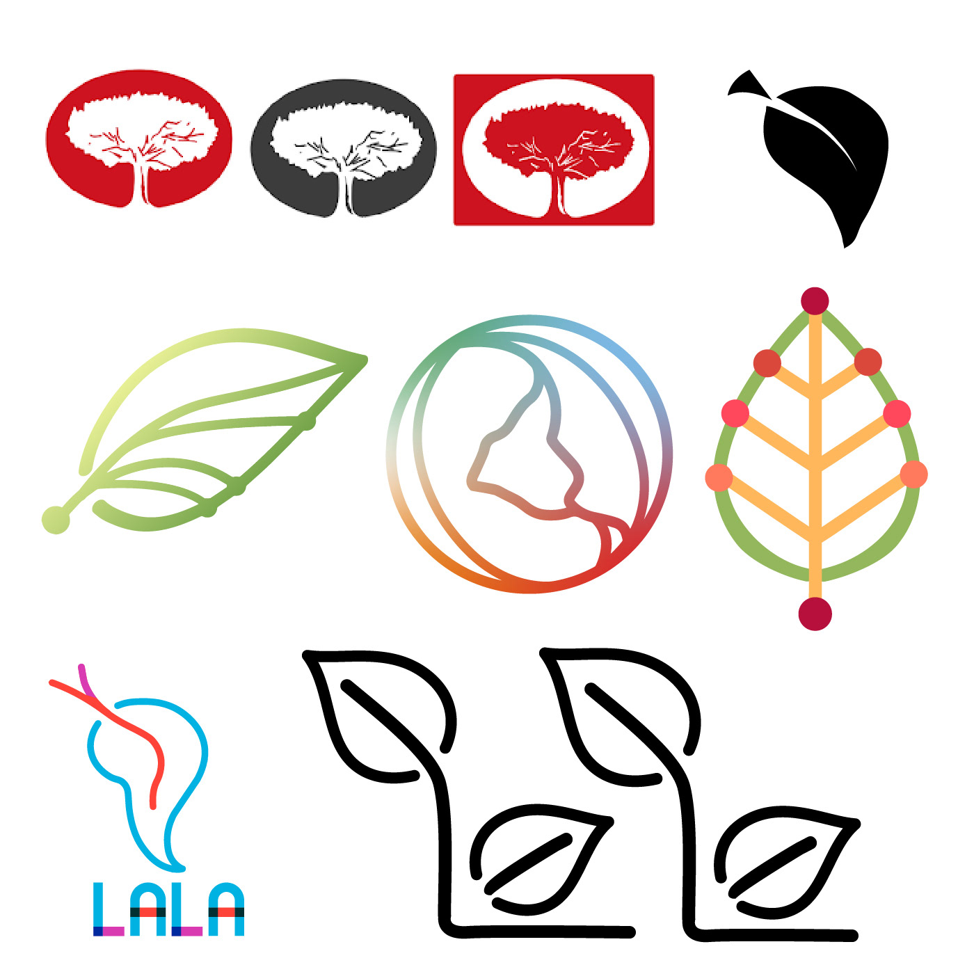
The submissions could be grouped into about four common concepts when looking at them all together. From left to right, the concepts were a map of Latin America, using the signature LALA llama, having a text emphasis with graphic symbolism, and nature themed.
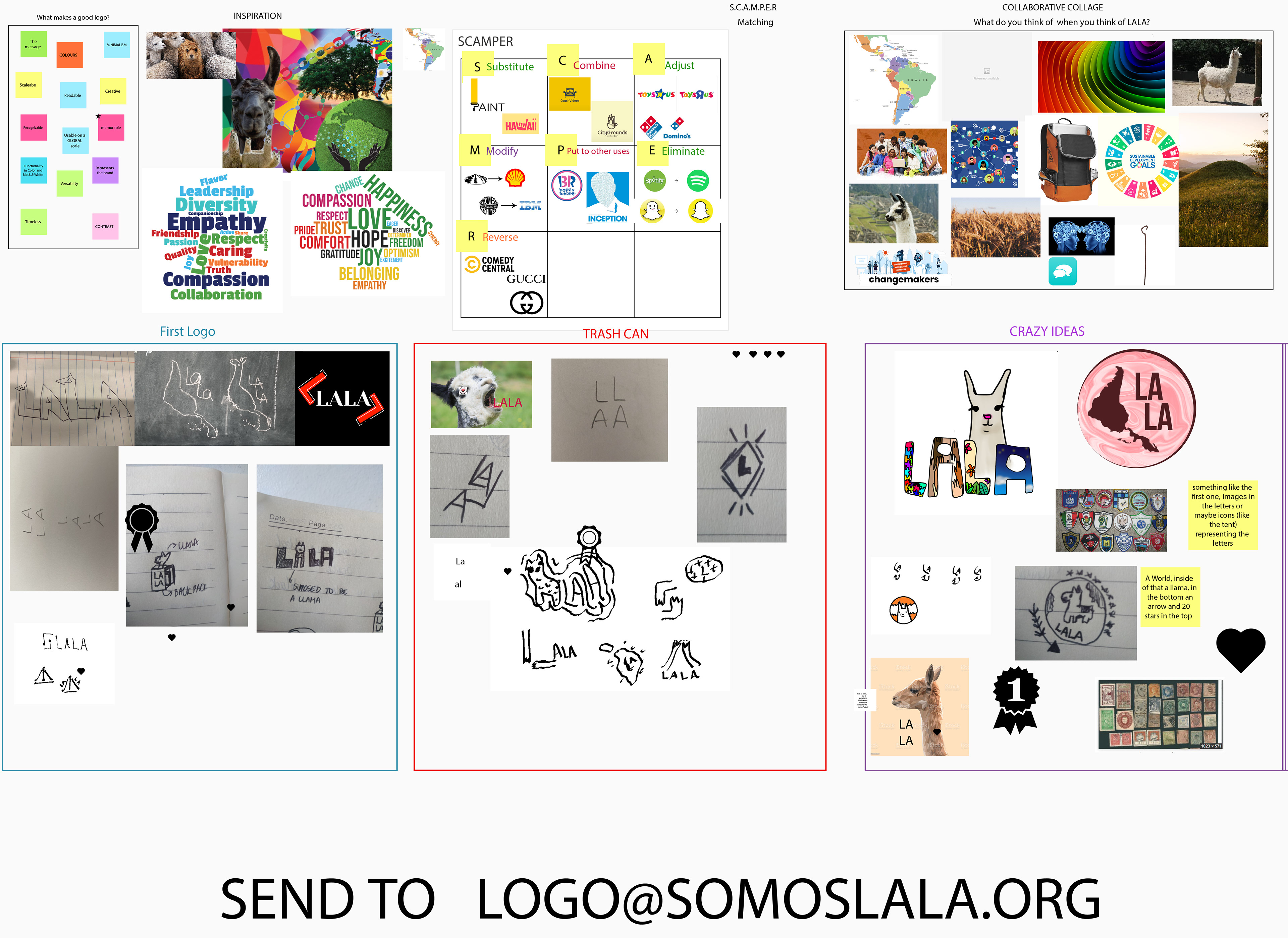
We also held a virtual Design-a-Thon event to promote more submissions, engage the community, and to have some fun along the way!
Some key points of the Design-a-Thon were learning what makes a good logo, the brainstorming technique SCAMPER, a collaborative collage representative of LALA, and finally some work time for participants submissions.
Brainstorming and Creation
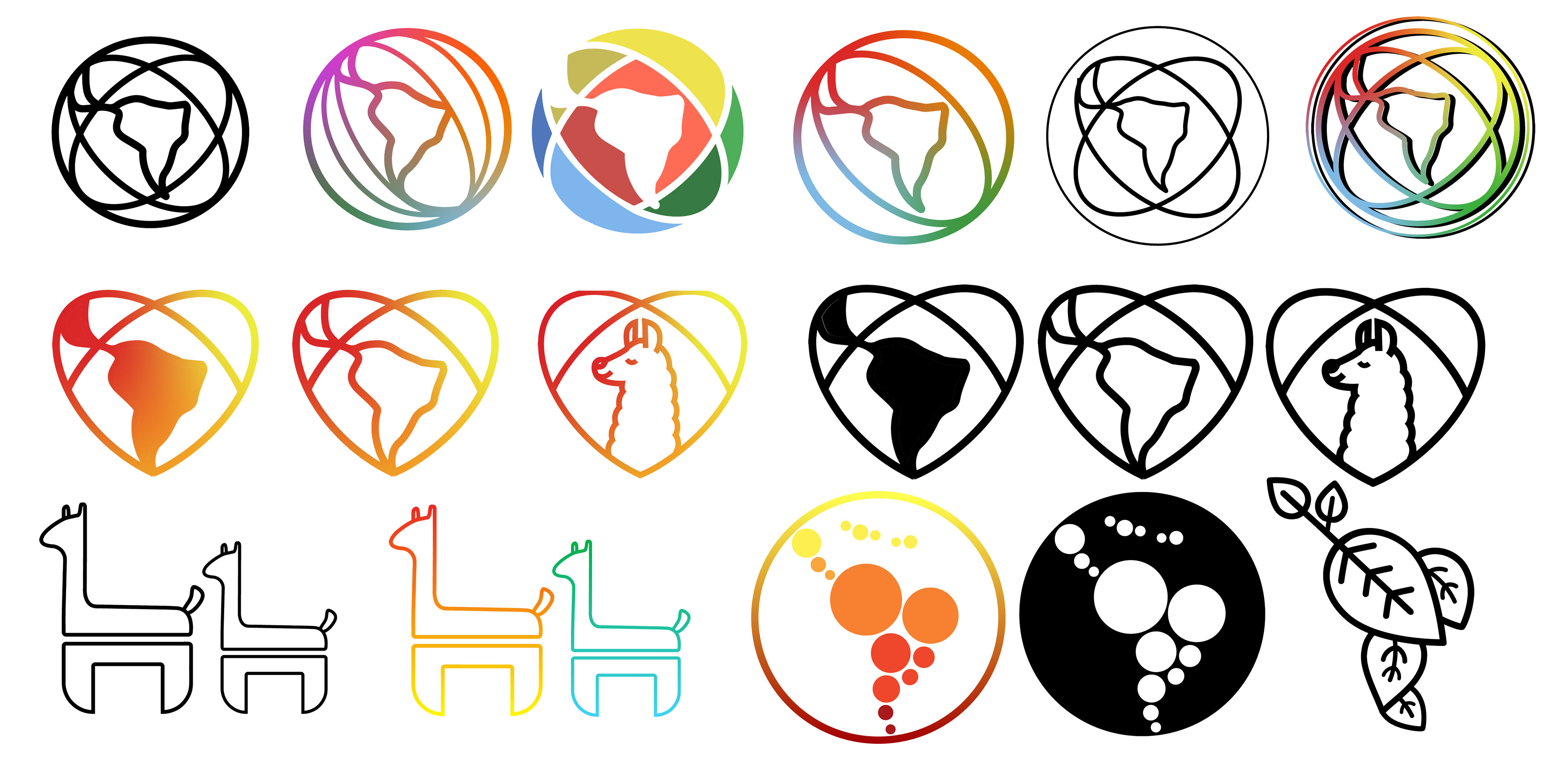
Taking into consideration survey data, community submissions, internal LALA team meetings, and using my logo design knowledge I brainstormed and created many concepts, that continued to narrow after meeting with the LALA team and hearing feedback from members.
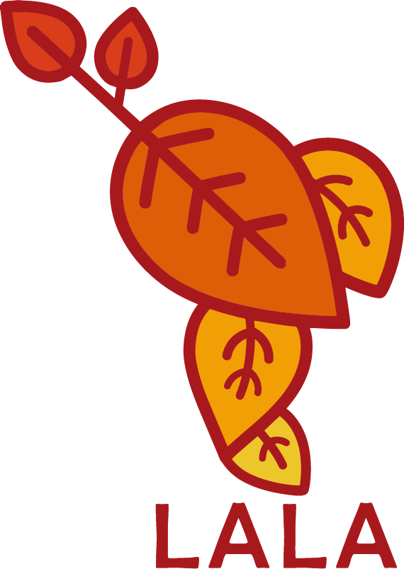

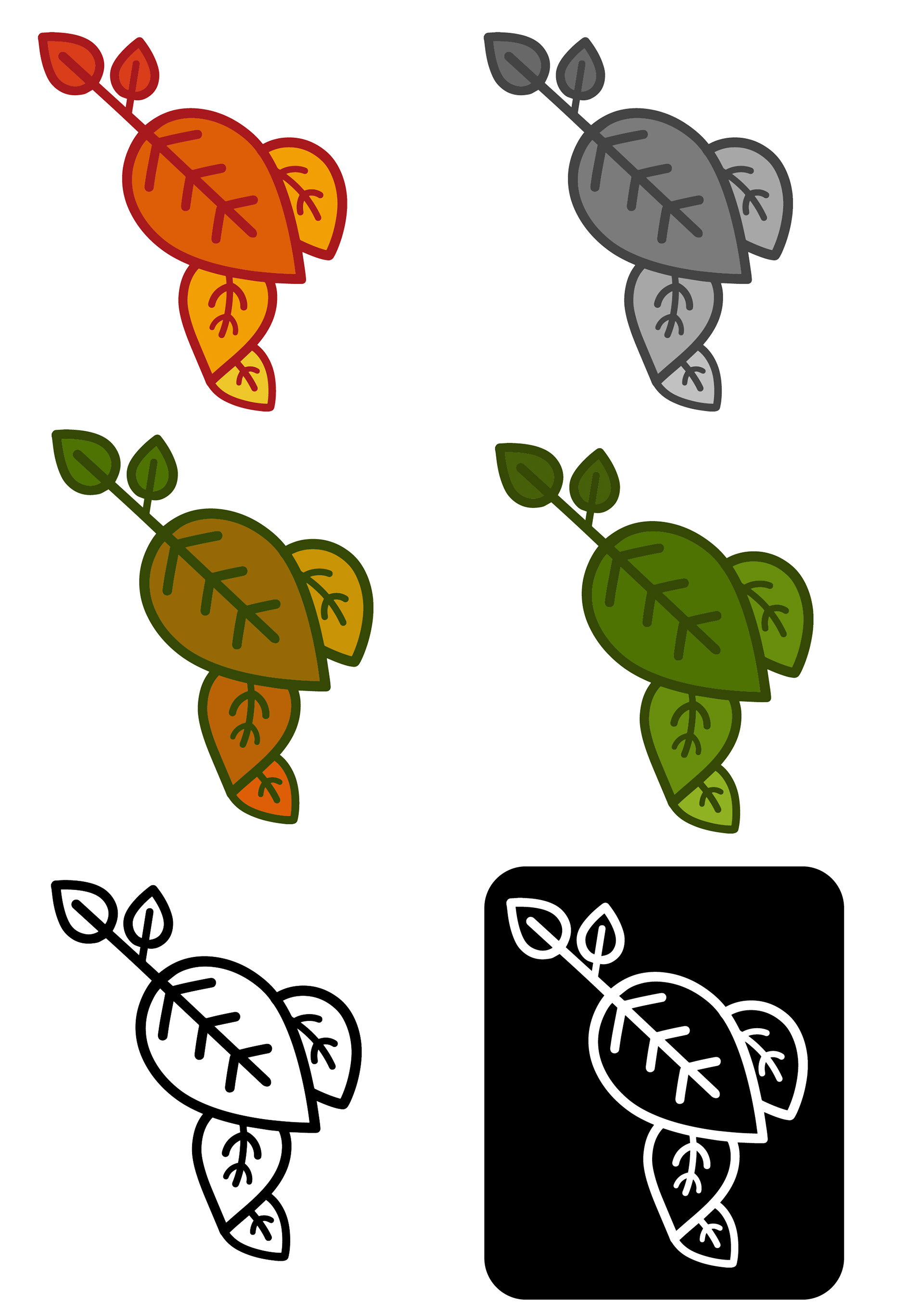
This concept represented LALA's connection with nature. This logo shows growth and connection within the natural form of the leaf. The specific leaf shape is from the Samauma tree. This tree is located every region of Latin America.
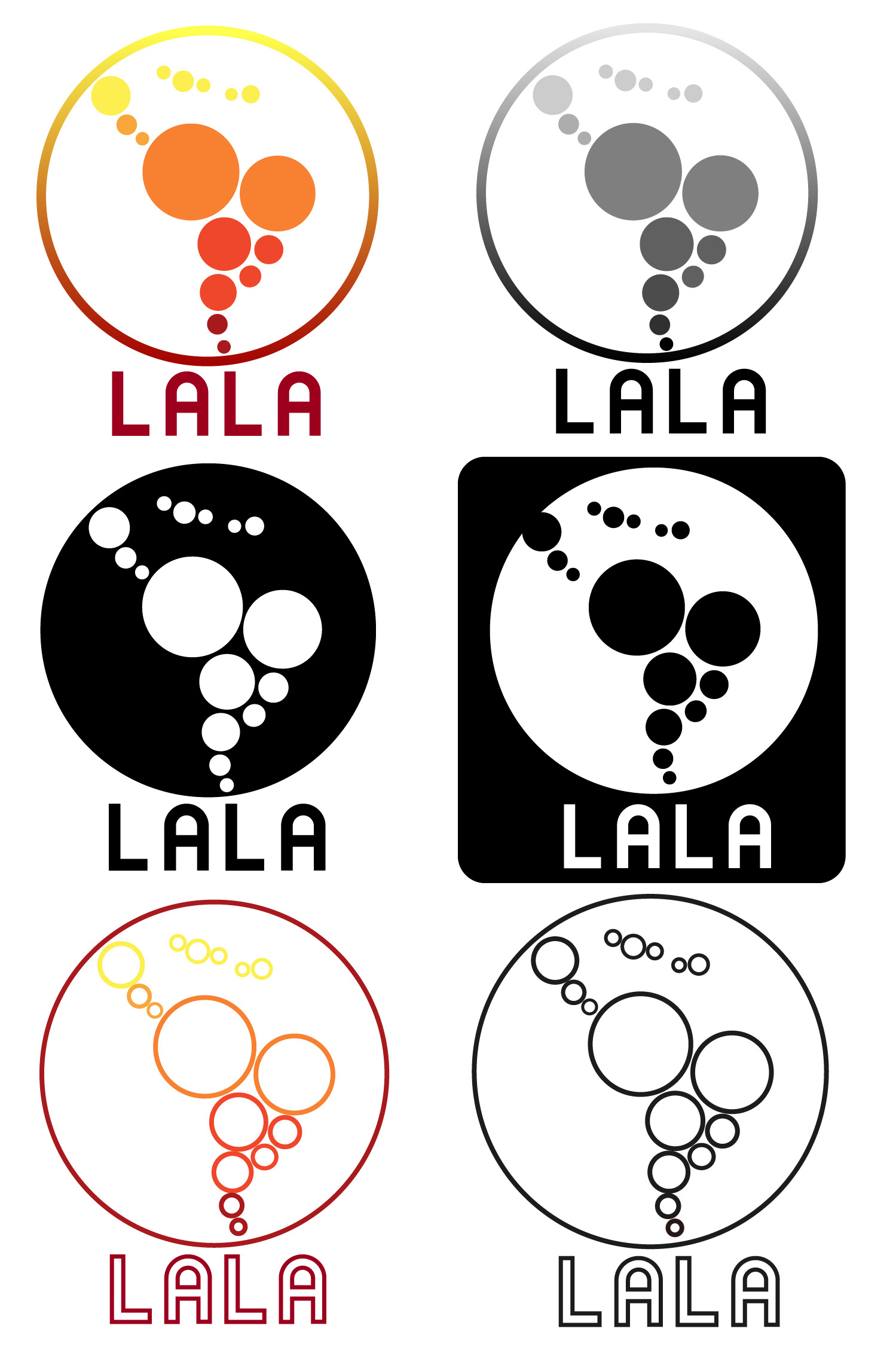
This concept was to most closely reflect vision of the previous LALA logo with a much needed update. This version offers much more versatility and emphasizes the symbols of community and a collective.
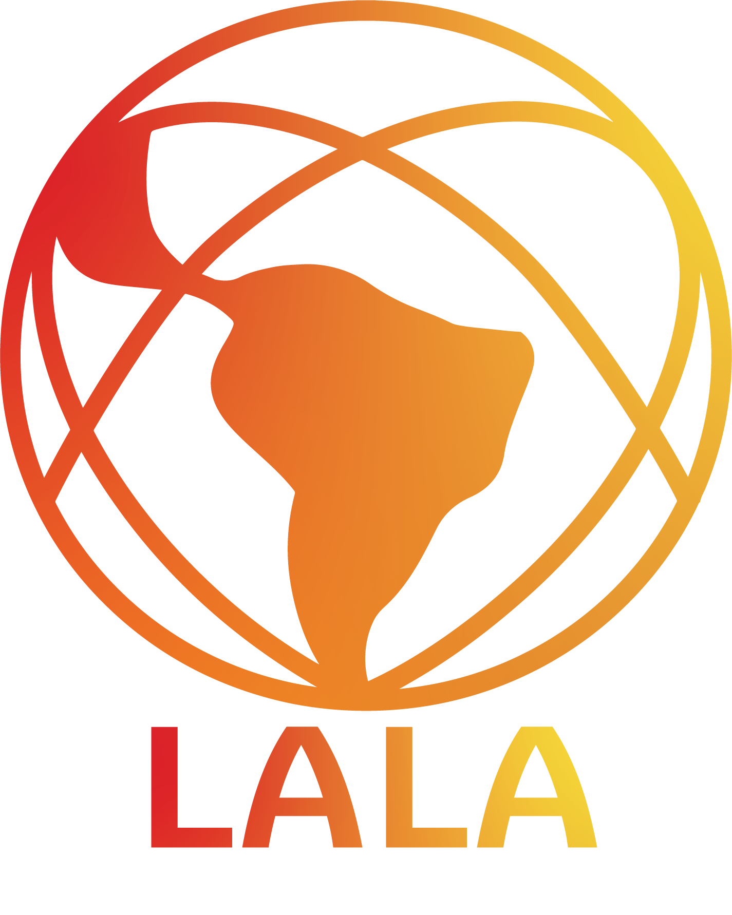
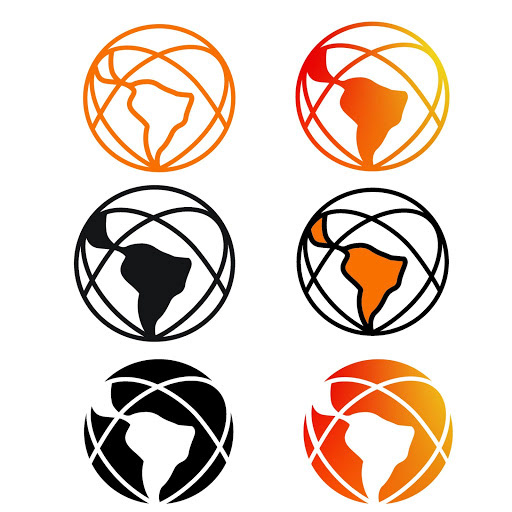
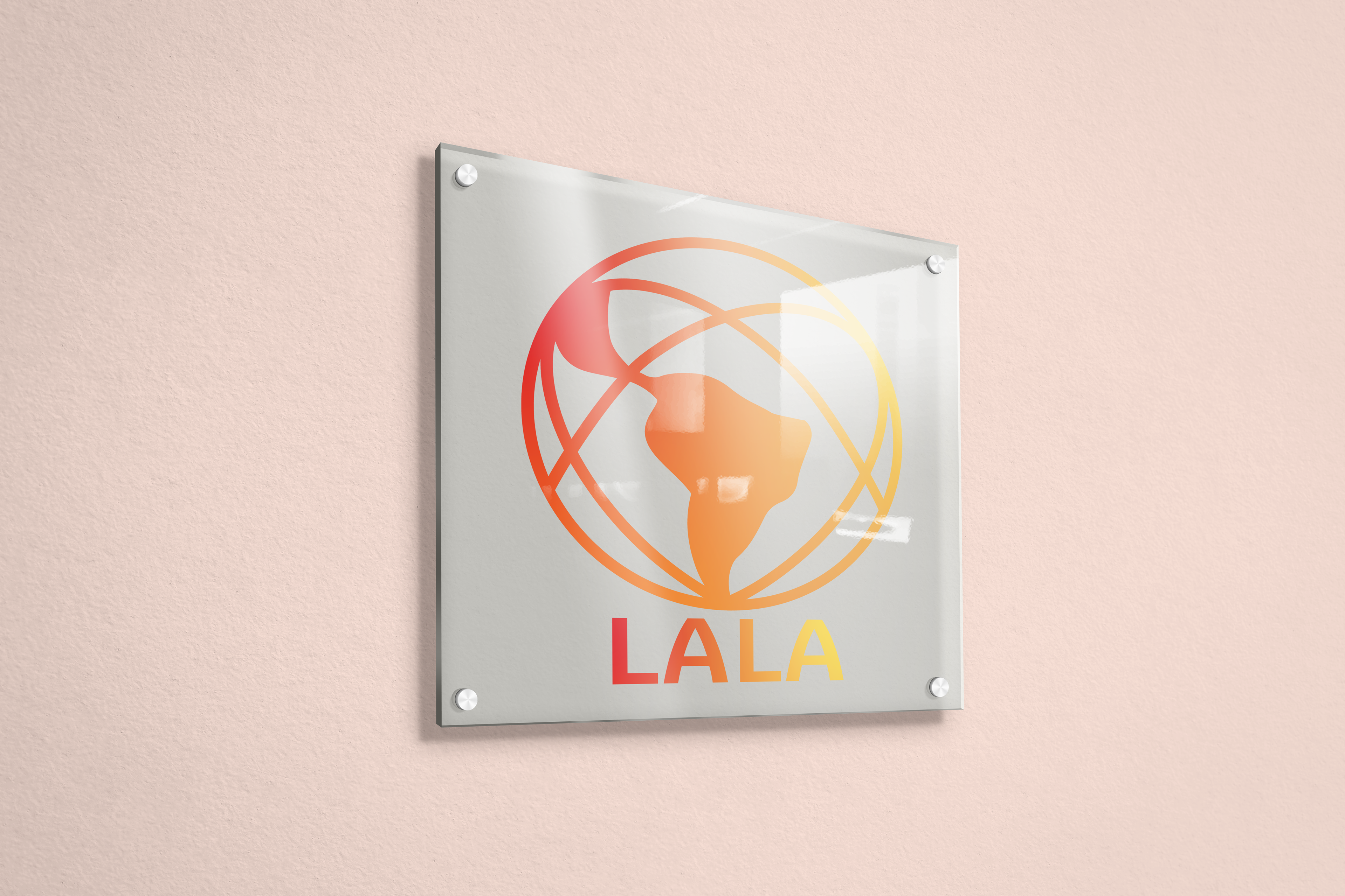
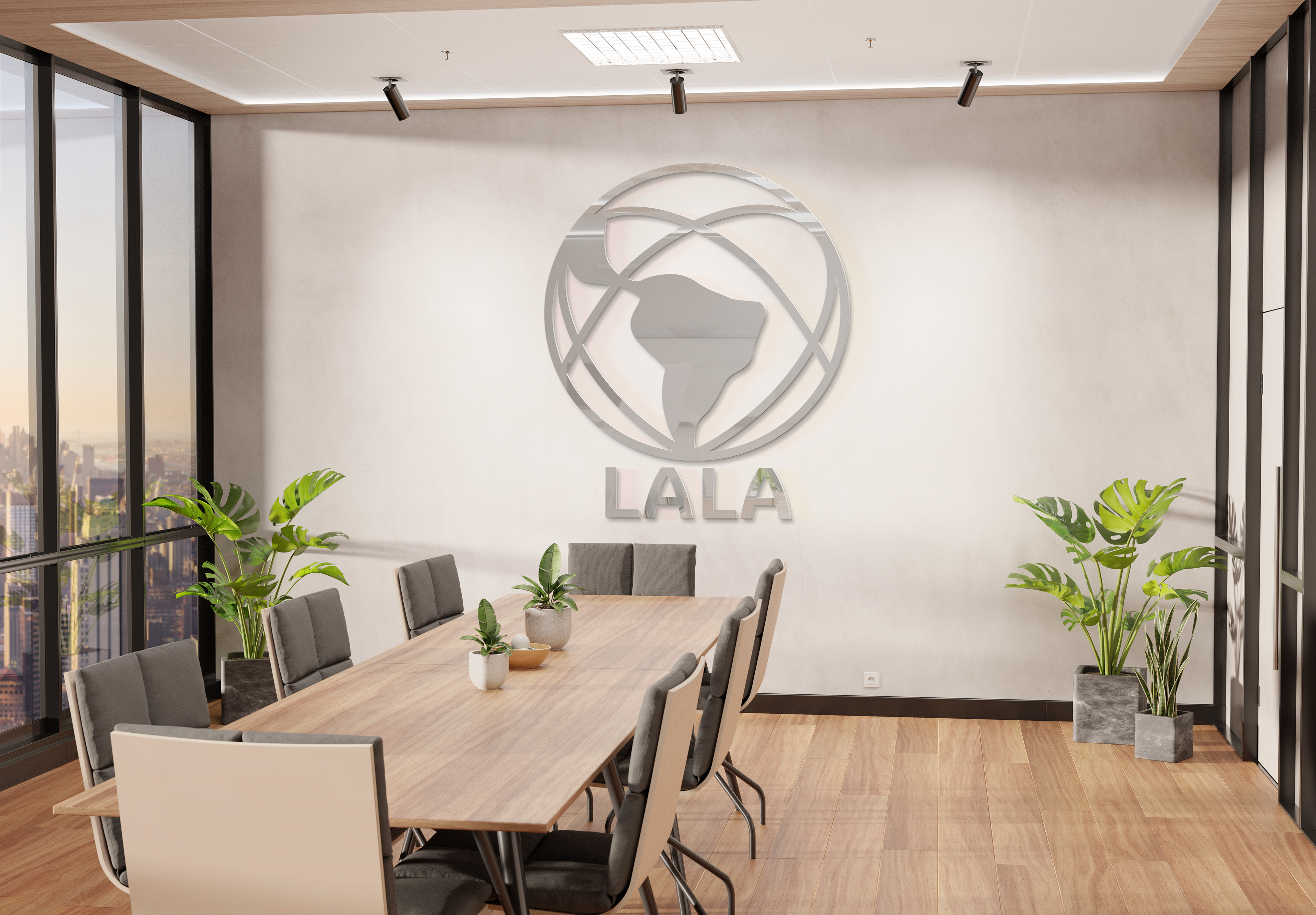
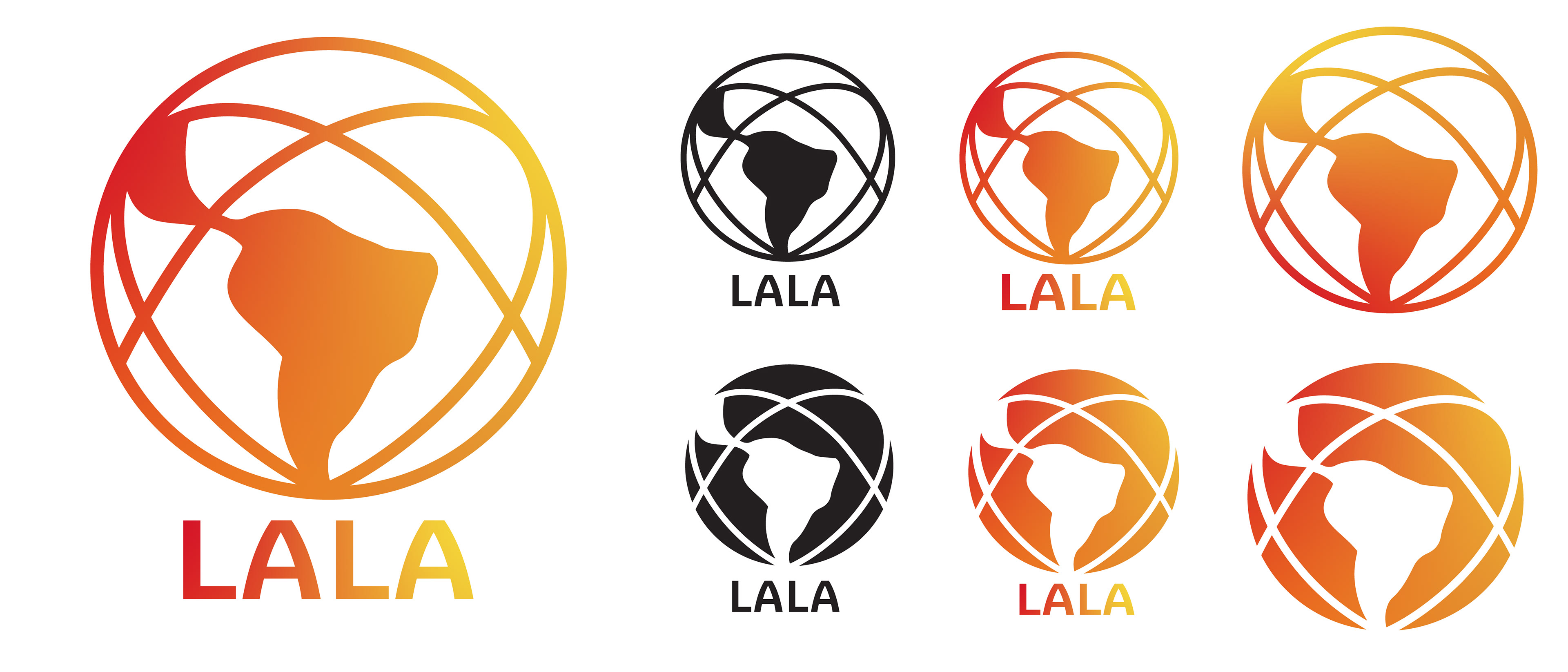
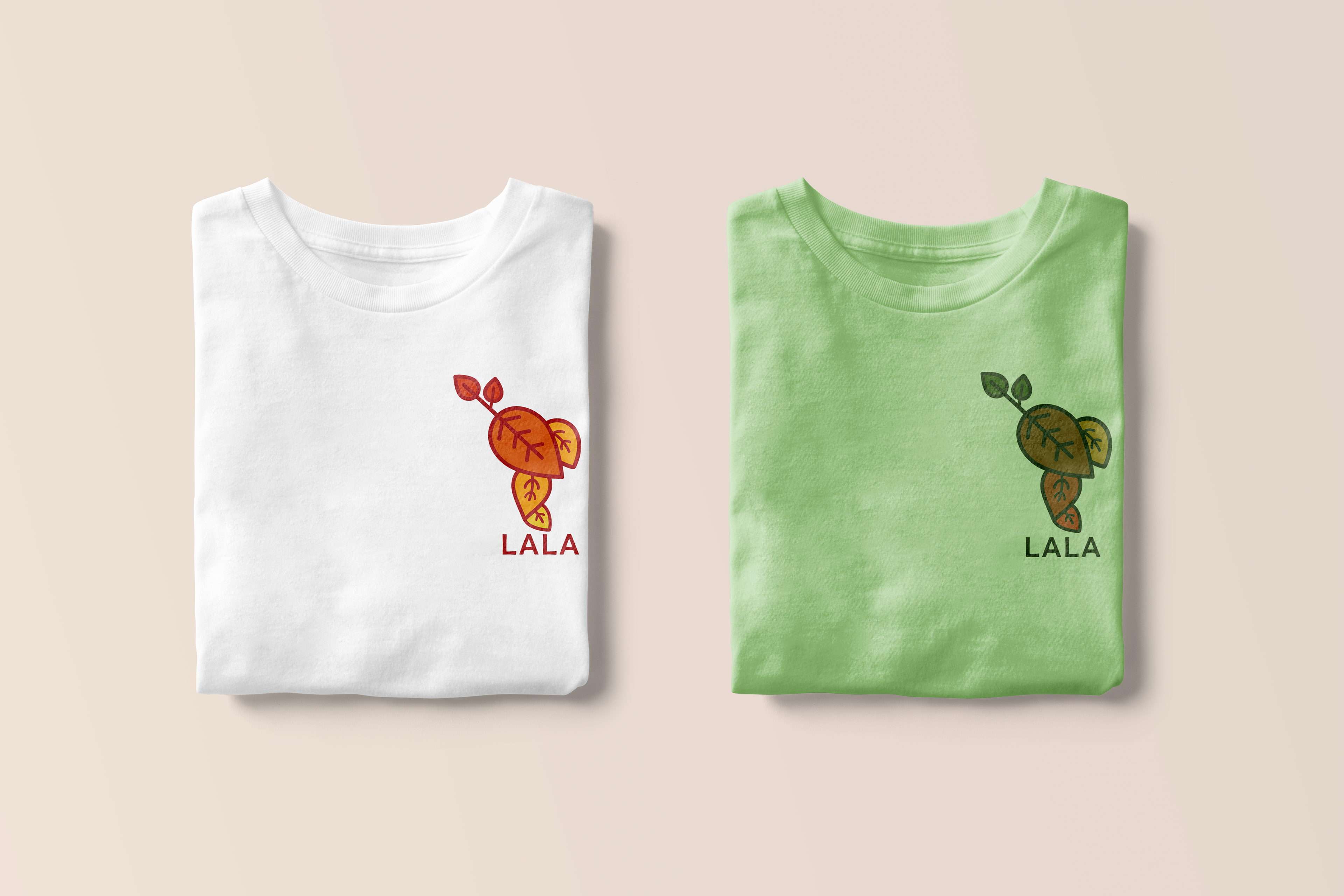
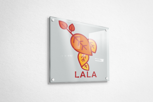
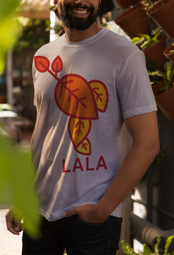
The final and chosen concept was based on the global aspects of LALA. Based off of the survey data the overwhelming feeling connected to LALA was love, and I wanted that to be seen within the logo. I also used a more warm, fun, and youthful color pallet to better reflect what LALA really is. The final image was a fun mockup of what the new LALA Hub in Brazil could have as a board room focal point.